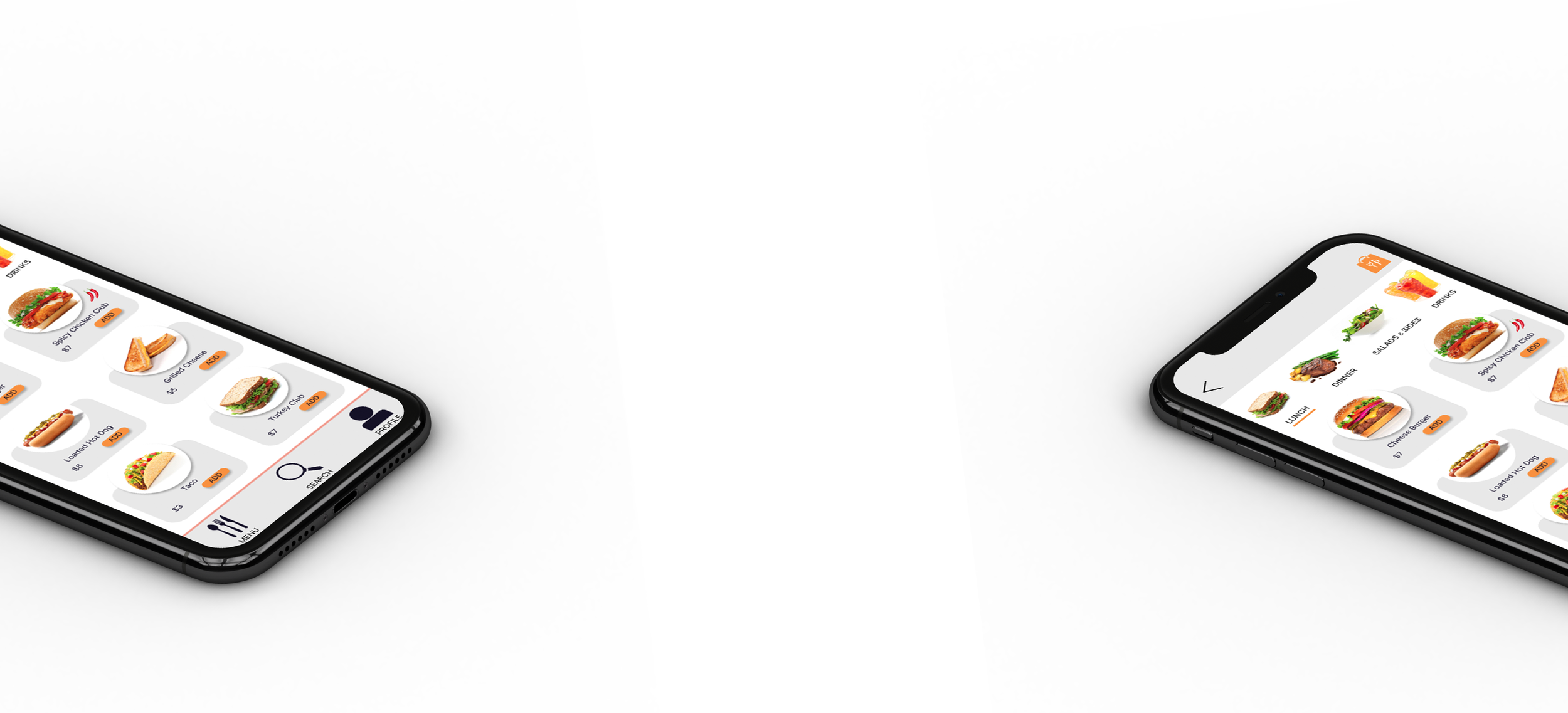
Ross Grill
@ Emerywood Country Club
Project Overview
The Product:
Emerywood Country Club wanted an app that would allow their members to place an order for food and drinks without having to leave their location by the pool.
Role: Research, Testing, Design
Project: Ross Grill
Duration: Oct-Nov 2021
Pain Points:
Cart notification
In general, users wanted a notification letting them know that their item was added to the cart
Order review page
All users wanted a review page before check out to verify order, payment and delivery location.
CTAs on delivery page
Several users had issues with the size of the delivery page CTAs.
Order CTA on sign in/sign up
In general, users felt an order CTA on the signup/sign in page was confusing and not needed.
Primary
Name: Katherine
Age: 35
Family: Married 3 Children
Occupation: Sales
Katherine is a mom of 3 who needs to be able to place a food order from the grill and have it delivered to her table because she doesn't want to leave her children unattended in the pool.
Secondary
Name: James
Age: 45
Family: Married 2 Children
Occupation: Finance
James is the dad to 2 boys that love to play at the pool all summer. James works from the pool on Fridays so he can take his boys but can’t spend time waiting in line to order and pick up food.
User Journey Map
The goals for the poolside grill app is to make it easy for a member to login and place an order for food and drinks as well as having these items delivered to them at their numbered location.
Paper Wireframes
Multiple wireframing sessions were performed with the pieces that were preferred starred in green. Then the results of all of those pieces were developed onto one final frame seen on the right.
Low-Fidelity Prototype
Using the completed set of digital wireframes, I created a low-fidelity prototype. The primary user flow I connected was for the login or signup page then menu pages, delivery and payment so the prototype could be used in a usability study.
Usability Study: Findings
The moderated studies conducted revealed several Stopping points in the user Journey. Continued development is in process to create a happy path for users.
Round 1 Findings
No added to cart notification
Buttons on Delivery page wee too small
No review page before completion
Round 2 Findings
Cart not showing number of items added
Profile, favorites, and search features not functioning
Refining the Design
Mockups
Delivery page changes made buttons larger and back button in a consistent, easy to find location.
High-Fidelity Prototype
High-Fidelity Prototype
The high-fidelity prototype presented a more robust user experience allowing for start to finish user testing. The user flow connects all menu items to the cart and has the addition of the ”added to cart” pop up per the first user study.
Accessibility:
The color of the CTA’s and navigation and type size were verified through the Ally Color Contrast Checker. Also, Icons and images were used whenever possible to make the app and process easy and understandable for a variety of users.
Impact:
Offering this app to club members is a great way to solve their problem of having to wait in line to order food and then again to pick it up when ready. I am excited to offer this app for use during the Summer 23 season. During that time additional testing will be performed using club members and updates made from those findings.
Learnings:
Colors, and button sizes are so important to consider for accessibility. Because this app will be used by a wide range of ages it is also very important to make it easy to understand and use.


